Senior Product Designer
CVENT / ATTENDEE HUB ICON CUSTOMIZATION
Years of customer feedback showed that limited customization was forcing very different brands into similar-looking experiences, and sometimes putting them at odds with their own guidelines. I led the icon work within the broader theming initiative, defining a flexible model that could work consistently across web and mobile despite legacy and platform constraints.
Product Designer · project lead
Product design + research partnership + system definition
Attendee Hub app + web + configuration

THE PROBLEM
Attendee Hub offered some theming controls, but fixed iconography still pushed different brands toward the same visual experience. Requests for “custom icons” in quarterly reports reinforced the need for more brand control.
THE DESIGN CHALLENGE
Define a flexible icon model that worked across app + web despite legacy assets, inconsistent naming, and missing size standards.
THE OUTCOME
Launched with six icon packs; 37% of events created in the quarter after launch used a non-default icon pack. Individual icon swapping and five additional packs followed, expanding customization options.
THE PROBLEM
Within the broader customization effort, icons were one of the most persistent fixed elements. Even as planners adjusted other parts of the experience, the same iconography appeared across every event—making it harder for the product to fully reflect their brand.
COLOR
TYPOGRAPHY
ICONS
ILLUSTRATION
LAYOUT
01 / DEFINING THE MODEL
Once icons became the focus, the question wasn’t whether to offer more choice—it was how much. We explored global icon packs, individual swaps, and fully custom uploads to find a model that gave planners flexibility without turning every icon into a design decision.


DESIGN DECISION
02 / RESEARCH
62 current Attendee Hub users
+ 39 internal participants
I gathered icon examples and partnered with UX Research to test 12 visual directions. We looked beyond preference alone, asking which styles could realistically work with customers’ brands and whether the range offered enough variety.
12
DIRECTIONS TESTED
Broad visual exploration
LAUNCH PACKS
Research-supported starting set


03 / CORE INTERACTION
A single pack choice could update hundreds of icons across the event experience. Planners could then swap individual icons when a default metaphor didn’t fit- without breaking the broader visual language.
Product tradeoff: We recommended preventing duplicate icons to preserve distinct navigation cues. The shipped model allowed duplicates, prioritizing planner flexibility.
04 / IMPLEMENTATION DEPTH
Making one pack selection update hundreds of icons across app and web required a reliable semantic map underneath the UI. We aligned naming, mapped equivalent icons across packs, standardized icon sizes, and created conventions engineering could implement consistently across platforms.


05 / SYSTEMS THINKING
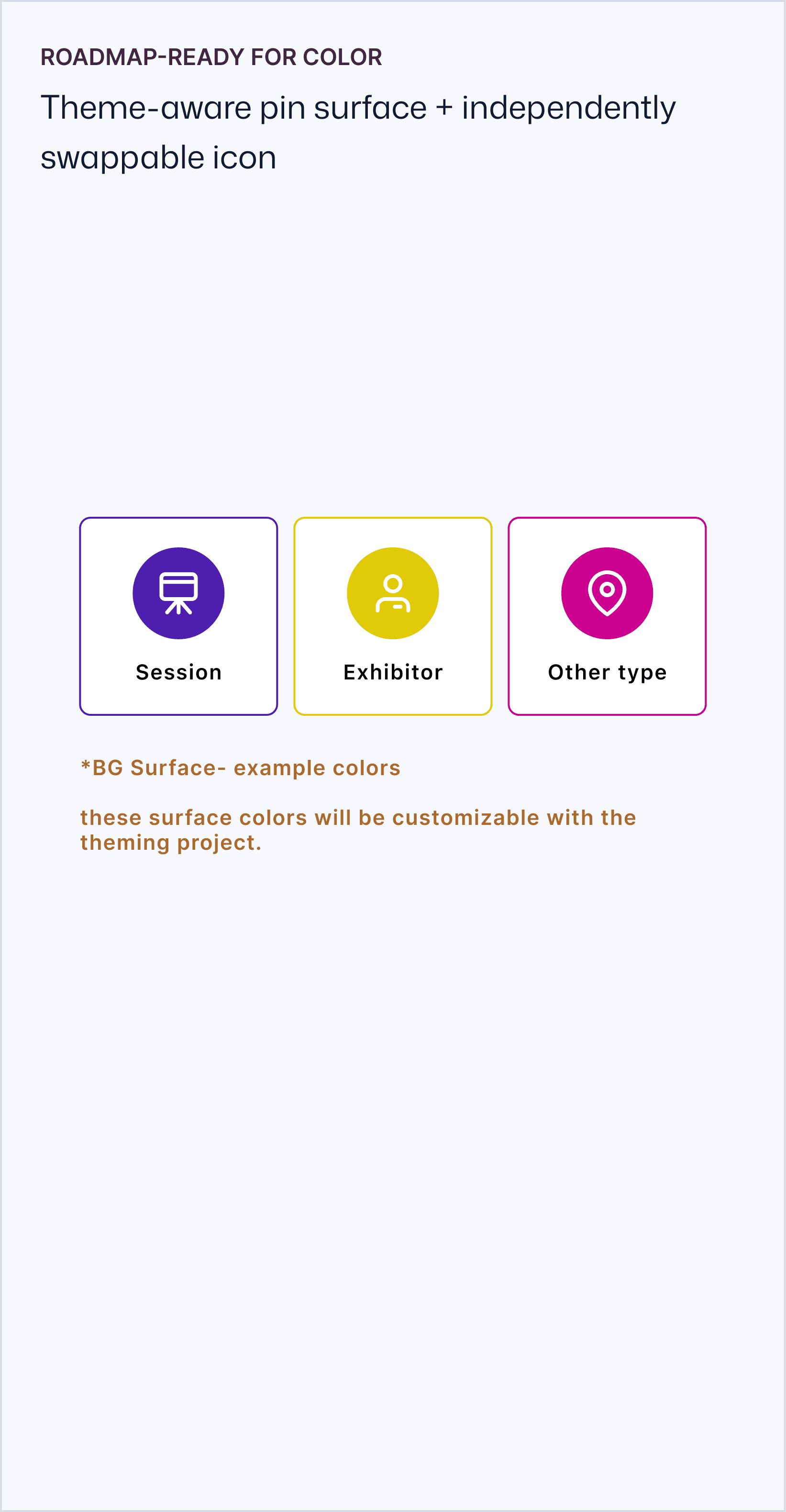
While mapping the surfaces that needed to support icon packs, we found an exception: floor-plan pins were hard-coded PNGs, with the icon and pin surface baked into one image. To make pack switching possible, we needed to separate them. Since color theming was already on the roadmap, we structured the pin surface so it could inherit event color later instead of rebuilding it again.


ARCHITECTURAL DECISION
WHAT CHANGED
37% of events created in the quarter after launch used a non-default icon pack.
Planners could keep the default, making this an early adoption signal for optional brand customization.
REFLECTION
Icons were only one part of the broader theming effort. Because each enhancement shipped independently, it was easy to evaluate them as a series of small changes. Looking back, I would have done more to show the cumulative experience earlier — not just what each feature added, but what they made possible together.
THE FULL EXPERIENCE
The impact became clearest when the pieces were shown together.

